Having started a couple of businesses before actually becoming a web designer, I’m very familiar with the start up journey. In the initial stages of coming up with a great business idea, when clients are scarce but you desire to showcase your services to the world, having a website is paramount.
Fortunately, website builders like Wix and Squarespace simplify the process for non-designers, allowing users to select a template and customise it. This approach is a perfect way to establish your online presence and test the waters before investing in full-scale branding and web design. If you’re opting for the DIY route, here are five tips to guide you.
- Stick to the Template Layout:
When customising a template, it’s important to stick to the layout. For example, wherever there’s a heading, replace the text with your own heading, wherever there’s a photo, replace it with your own photo. Straying too far from the template can result in a disorganised design. Consistency is paramount for creating a visually pleasing and cohesive website.
- Opt for 2-3 Fonts:
A common pitfall in DIY websites is the overuse of numerous fonts. My recommendation would be to keep it simple with 2-3 fonts—one for body text, one for headings, and another for subheadings. If you’re going for just two fonts, use the heading font in a smaller size for subheadings. If you haven’t already, be sure to check out my post ‘20 Free & Affordable Fonts for Your DIY Website‘ which goes further into how best to use fonts when DIY-ing your website.
- Select 4-5 Colours:
Similar to font choices, it’s important that you limit your colour palette to 4-5 colours for a visually cohesive design. A website with too many colours can cause confusion and weaken your brand’s identity.
When you think of major brands, such as Coca Cola, Starbucks or McDonald’s, certain colours come to mind, that’s because these brands only use a selection of colours throughout their branding. We recognise the Coca Cola red, the Starbucks green and the McDonald’s yellow. These colours are memorable.
When compiling your brand colour palette for your DIY website, I would recommend selecting 4-5 colours.
- Main Colour: This is the colour that your brand will be recognised for— something bold and memorable.
- Background Colour: This colour will be used on your website as the main background colour. This colour should be quite pale, so that text is accessible and visible. Think colours like beige, ivory or pale blue.
- Accent Colours: The remaining 2-3 brand colours will be accent colours to support your other two colours. Places that you’ll use your accent colours will be for things such as text box backgrounds, image background, buttons etc.
When selecting your colours, be sure that they complement one another well. It’s also important to be mindful of colour theory— certain colours convey particular meanings, so it’s important that the colours you select are appropriate for the type of business you have. In addition to compiling a colour palette that looks good, you want to ensure that it communicates the essence of your brand to your audience effectively.
- Use Good Quality Stock Images and Videos:
While a professional photoshoot might be out of budget, fortunately, platforms like Pexels and Unsplash offer a vast selection of high-quality stock images and videos. Personally, I prefer Pexels for its extensive collection and user-friendly filters for orientation, size, and colour.
- Make Sure Your Website Works on Mobile
Given that over half of website traffic now comes from mobile devices, ensuring your website is mobile responsive is crucial. Elements may function differently on mobile, so optimise photo and text sizes for mobile viewing to maintain a seamless design and prevent information from being overlooked.
I hope these tips prove valuable in your DIY website endeavour. Wishing you the best as you embark on this journey!
Ready for a Sleek, Modern Website?
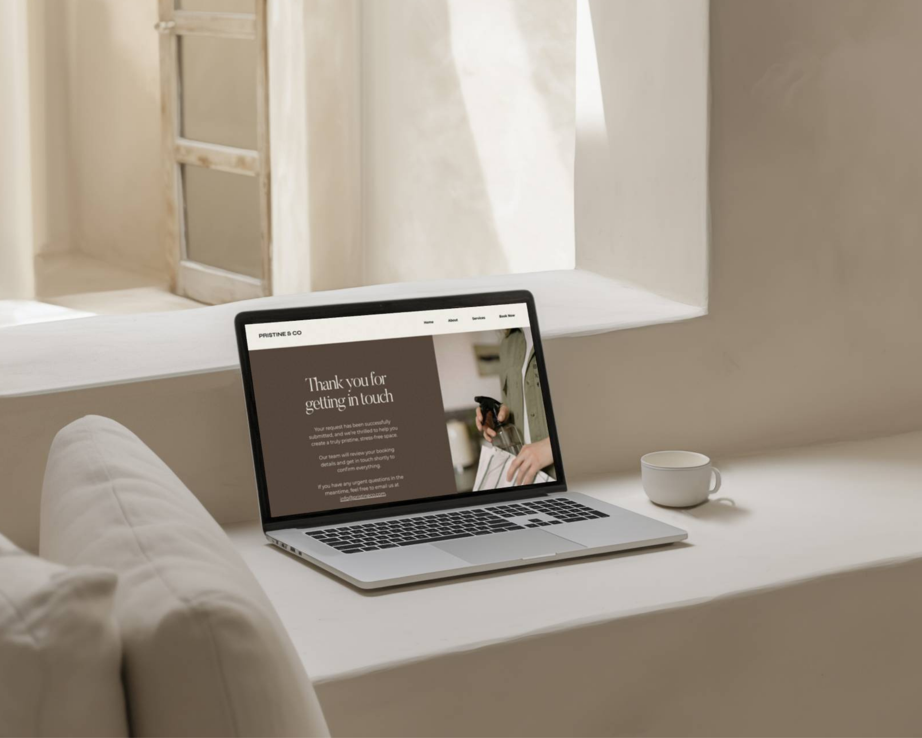
If you’re looking for an easy-to-use, modern, and sleek website template, check out some I’ve personally designed—Pristine & Co and The Vine & Branches. These templates are perfect for creating a polished, professional site without the hassle.
If you ever need guidance, feel free to reach out through our inquiry form for a free 15-minute consultation. Happy DIY-ing!
